Just like new technologies, the world of web design is in a continuous change. True, we now have new tools and platforms to make sites awesome, but the public’s expectations have changed as well. If once it meant a lot to have a presentation page, nowadays you need to create an entire online personality for a company or a product (depending on how you want to approach the web).
Furthermore, web design is no longer a separate entity. With platforms like WordPress, the design is created around SEO techniques and aims to optimize the experience for anyone who visits. We now focus on the visual and many sites make use of media files (such as video, animations or sound) to make the experience more interesting.
But given the changing nature of web design, we find it’s important to be at least a few steps ahead, which is why we identified the top three web design trends for 2019.
A Focus on Great Fonts

If the last few years focused on perfect visuals, the future of web design is represented by stacked text. Nowadays it’s OK to have words on the home page (the more, the better), so it’s crucial to identify a selection of fonts (a typeface) that works for you.
The best typeface for a web page is easy to read and looks good even when the text is stacked. But it’s also about the shape of the letters and how much personality they have. After all, the intent is to have users read your text, not be visually aggressed by it.
Forget about Perfection

People are used (and fed up) with perfection so they don’t stop when they see a flawless WordPress design. They just admire it for a few seconds and move on to their lives, without giving it a second thought.
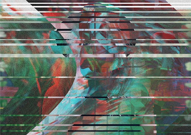
So, the trend had to change! That’s why videos and images that are intentionally glitchy are on the trend now. But this doesn’t mean bad videos are back in fashion (if they ever were). The glitch effect is intended to be creative and impressive, not frustrating and daunting.
Even more, the concept doesn’t work on any type of content (at least not yet), so it’s best to use this technique with caution. However, when used right, it catches users’ attention and makes them stop and acknowledge your site.
Art & Movement as Part of the Web Design Trends for 2019

Nowadays, really good web pages are a piece of art because they incorporate colors and movement in unique and creative ways. Of course, the final goal is to make the user take a second look, but the trend also makes you think about abstract art because the visual impact is quite powerful.
Just like with the glitchy videos, using abstract art on your site doesn’t always make sense. However, it always makes sense to use images to your advantage, and you can always use good visuals to create the illusion of movement.
Overall, the web design trends for 2019 are all about visual effects and attraction. Of course, you also have to keep in mind that visuals tend to load a web page, so make sure to not ignore the old and tried SEO techniques!
