In many cases, the website is one of the most vital elements for small businesses. It is the main way the business gets to attract clients and market services and products, so it is the very heart of the sale process.
But how do you get from design to great conversion rates? According to our experience as a custom web design company, you need a site that’s awesome!
While this is a general explanation, it is true that an aesthetically pleasing design will make your viewers stop and browse. This happens because the site is easy on the eyes, creating a user-friendly interface that keeps people entertained while offering a wonderful browsing experience.
A beautifully designed site is impressive and keeps users engaged as they browse through pages. Even more, it’s important to make sure the design supports the essence of your business so users don’t get confused and leave. This is why the services of a custom web design company are more than needed when you put together the interface. A company like ours has the experts and the necessary resources to help create gorgeous and affordable designs for small businesses.
Top 3 Awesome Small Business Sites
Since images are more powerful than words, let’s take a look at some of the most beautiful sites that not only convert but boost the business to the top.
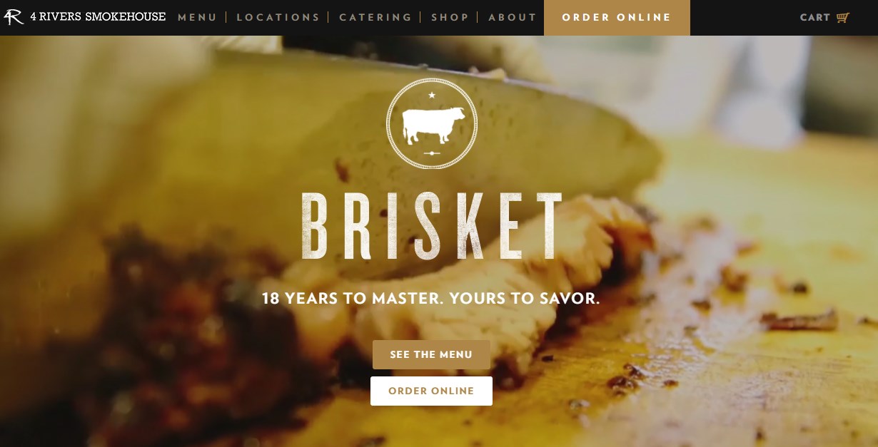
#1: 4 Rivers Smokehouse
The design is simple but it speaks volumes to curious viewers or returning customers. Using parallax scrolling, the site uses gorgeous images to make you think about delicious food and fantastic flavors. It only takes a few moments for the design to catch your attention and, even if you don’t usually like meat, you may want to drop by just for a salad.
As a Milwaukee-based web design company, we helped create many similar designs for local restaurants and coffee shops. The secret is in the images and the journey you make the user take while browsing.
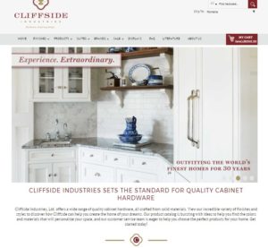
#2: Cliffside Industries

Small businesses come from all sorts of niches, so a custom web design company must adapt to every client’s needs. In the case of Cliffside Industries, the design is clean and follows a more traditional line. This site is created as a luxurious catalog with an elegant interface and lots of navigation options that make browsing a true pleasure!
Their strong point is represented by high-quality images and the ingenious use of the available white space.
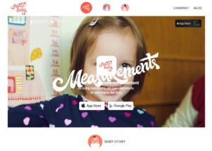
#3: Hello Baby

The design in this case is light but highly responsive. Users get more information as they interact with the site – they are not bombarded with useless details from the start. This is a great technique that helps with keeping viewers entertained and offering them exactly what they want when they want it.
The technique is called flat design and it is very popular among small businesses today as it makes things simple for the user. It’s easy to implement, but requires the attention of a professional custom web design company.
