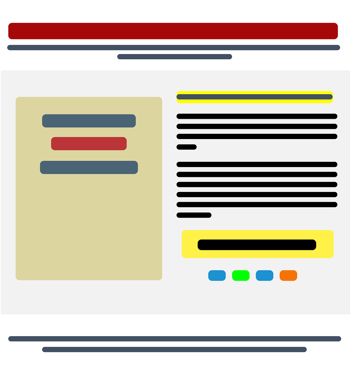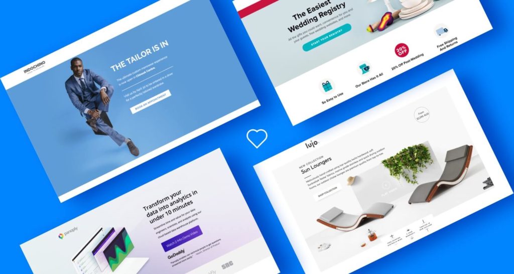
A landing page is simply your website, but it’s called a landing page because it’s only one page. You can scroll it, and it has a clear goal to convert visitors.
Convert can mean different things. For example, you can convert visitors to subscribe to your newsletter. This way, you can collect email addresses and evaluate interest according to how many people actually signed up. This is called lead generation. Or, you can convert visitors to pre-buy your product.
A landing page for your startup is a bold technique that can really work. You can get people so excited that they actually pay you before you launch. The idea is to make a page so simple that visitors get immediately directed to the main intended action you want them to do. Subscribe or pay!
So now, let’s get down to business and start building your landing page.
Build Your Landing Page: DIY or Professional Web Design Company
Many different services help you create your landing page. These online services allow you to create an intuitive landing page in just 10-20 minutes.
But the problem is many others (including some of your competitors) might be using these templates. So, how do you stand out? How do you design a landing page with a unique design and customized functionality that no other business offers? Hire a professional website design company!
At Symphony Software, we can design a landing page for your startup. In addition, we make sure that your landing page spreads the word and captures user information.
Key Components of a Compelling Landing Page

Creating a compelling and competitive landing page is important to achieve the expected conversion rate. Key elements of a good landing page are:
A Catchy Headline
Choose a heading that conveys your message strongly. It should promote attention, interest, and clarity. Your landing page needs to:
- Grab the visitors’ attention
- Inform people about your products or services
- Be short, not more than 15 words
A Compelling Visual Hook
Hook your visitors with an interactive visual experience, a stunning photograph, or a background auto-play video. This will keep visitors from bouncing from your landing page. As a startup, your landing page is the only chance to draw new visitors in. So, get them excited by a solid visual hook.
Bring Credibility
Add something which gives you and your business credibility. It can be awards, testimonials, big partnerships, or press articles.
Call-to-Action Buttons

Put compelling call-to-action buttons in several places. Make them big and easy to spot by using colors. For instance, orange and red buttons convert better than green and blue ones.
Short, Sweet, and Sensical Copy
Keep your message short and to the point. Don’t clutter your landing page with unnecessary graphics and/or large chunks of text. Instead, use whitespaces to create a neat and organized visual look.
Finally, be clear about the pricing and how it works. It gives clarity and transparency to your business, which can result in trustworthiness and a higher conversion rate.
Let’s Create Your Landing Page Today!
Your landing page can be an extremely useful communication tool. Symphony Software has designed many landing pages for startups as well as established businesses. We know what it takes to design a compelling landing page that drives conversion rates.
So, contact us to discuss your startup idea today. We’re waiting to hear from you.
