Going to design a landing page? Check out these designing tips for your landing page.
Landing pages are one of the best ways to convert your visitors into leads. It’s a standalone page that visitors are redirected to after clicking a link, advertisement, or email. Thus, they are actionable in nature.
Besides the purpose that it serves, a landing page should be visually appealing so that the users can stay for long. It should have high-quality and well-written content with perfect fonts and visuals.
Designing Tips for Your Landing Page
If you do not have much idea about it, then check out these effective designing tips for your landing page:
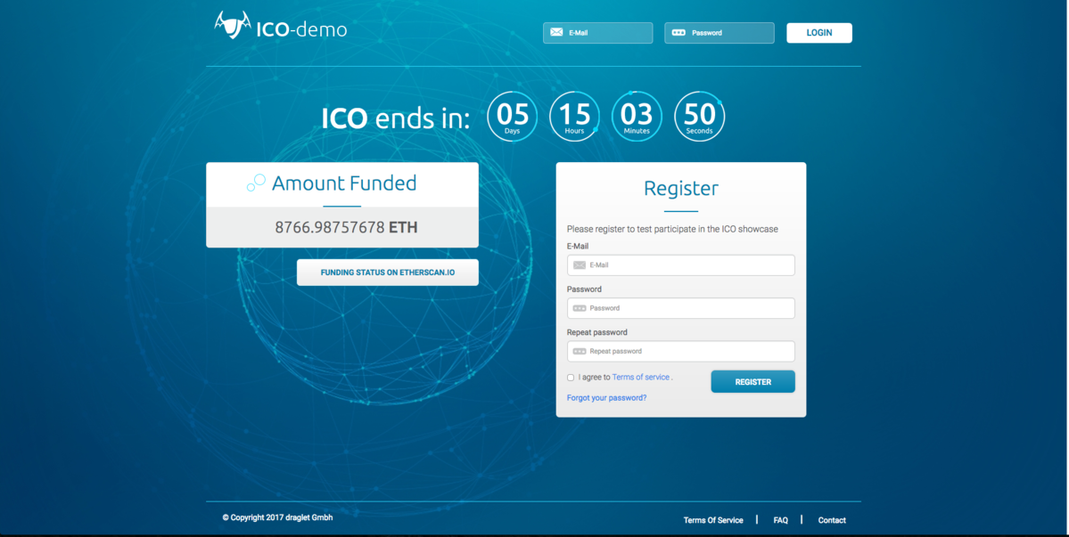
#1 Images, Videos, and Logos
First things first, the visuals. The idea here is to add an extensive number of visuals like header images, content images, and social media buttons. You should add icons and logos to make the page even more appealing.
Try to use real-life people in the pictures for that authentic feel. That way, users will believe that products and services are for them. You can also add infographics and videos for more promising outcomes.
The best thing to display on your landing page would be website goals. If you are selling an eBook, display its cover page on the landing page. Similarly, if you are offering free trials, add its interface to the same.
#2 Colors and Styles
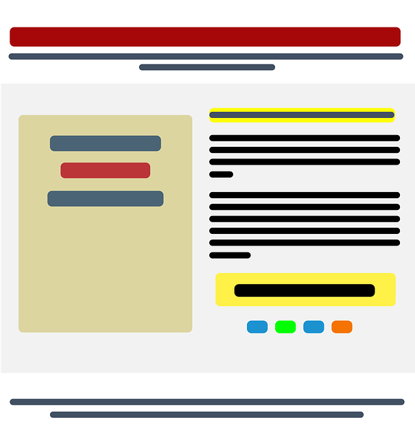
Besides that, do not forget to play with colors for your landing pages! You must not know that colors can increase the conversion rate for your landing page.
When deciding on the landing page color, check your website theme and the audience it focuses on. If it’s female dominant, then go for blue, green, or purple. Likewise, stay away from gray, brown, and orange hues.
Similarly, if your website targets men, go for deeper and bold colors like red, black, or blue. For CTAs and pop-ups, it’s recommended to choose bright colors.
#3 Fonts
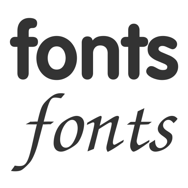
Using appropriate fonts is a key to the landing page’s success. You can either use one font throughout or mix and match as per your preferences. For important messages, always use bold fonts as it drives customer attention.
In terms of font styles, select an option that has multiple sizes. For instance, Robota comes in options like light, medium, bold, or very bold. So, you can use it for your landing page.
Similarly, if you are combining it with other fonts, go for sans serif and serif. They blend perfectly together. In the end, ensure a clear font hierarchy, and you are good to go!
#4 Lesser Navigation Links
While navigations are useful for your landing page designs, do not go overboard with the same. A landing page with plenty of navigation links can be distracting for the visitors. So, keep them minimal to ensure a better user experience.
#5 Short Paragraphs and Bulleted Points
While creating your content, always use shorter paragraphs as they are easy to read. Make sure to avoid excessive use of big text blocks. Also, if you have multiple points to show, list them precisely and display them in bulleted form.
Design Your Landing Page Like a Pro!
So, that’s how you design the perfect landing page for your website. At Symphony Software, we are proficient in designing the most interactive and compelling landing pages.
Thanks to our outstanding services, we have had an extensive number of customers for years. If you want to try out our impeccable services, then reach out to us today! We will be happy to help you.