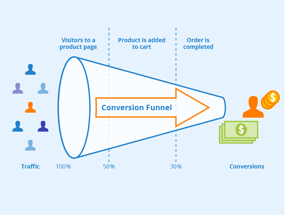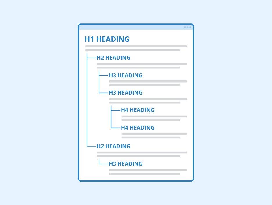
Headings are the second thing that visitors notice after the header. These are slogans that are written on the image top, mostly in bigger fonts. Besides catching user attention, headings encourage the users to stay on the page. This contributes to a higher conversion rate and extensive user traffic. So, we’re sharing heading & subheading tricks for higher conversion rate.
Below the headings are the subheadings that are written in smaller fonts. It gives more specific details of the heading content. Both headings and subheadings of the landing page should be high-quality, which various websites fail to provide. That’s why we have got you five must-follow tricks for that perfect heading/subheadings:
Heading & Subheading Tricks for Higher Conversion Rate
#1 Clear & Concise
Headings or subheadings should always be clear and to the point. It should be written in such a way that users should know at one glance what the page is all about.
Do not go overboard with too many texts! Choose a style that matches the best design trends. Try to speak about the primary goal in a few words, and your heading is done.
For subheadings, be a bit more specific than the heading . Provide a quick overview of the services, and you are good to go.

#2 Brainstorm and Come Up with Something Unique
Headings/subheadings provide a good first impression. So, if both these contents are top-notch, you have won the half battle. Think about your services and figure out how they could be flawlessly represented to the audience in a few words.
You can check competitors’ headings for inspiration and see how they did the job. Also, try to pay attention to their slogans or interact with them directly.
#3 Perfect Amalgam of Header Image and Heading
Both your header image and headings should go perfectly together. Ensure that they are not overwhelming to each other. Also, it should be clearer for the readers to view both the contents.
You can use a heading overlay on the top of the header image to make it stand out! Likewise, you can add contrasting colors for the perfect harmony between the two. Just make sure there isn’t any clutter within the images.
#4 Add Keywords to the Heading/Subheading

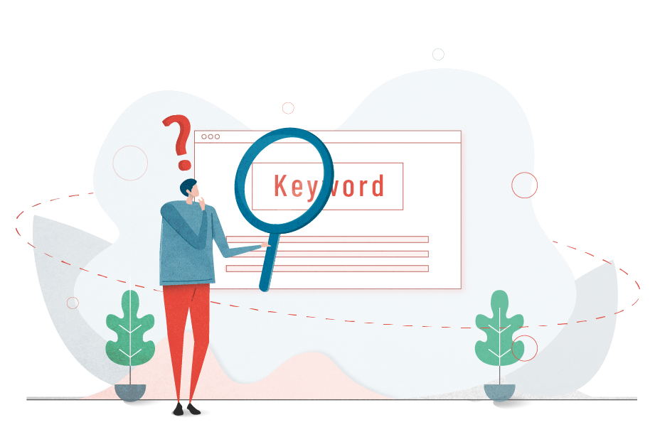
Do your keyword research through online tools and find some relevant keywords to add to the subheadings and headings. This tactic increases the chance of ranking higher on the search engine pages. You can also try adding conversion words like “Best,” “New,” “Save,” “Free,” etc., for better results.
#5 Don’t Focus on What, Focus on Why!
Instead of bragging about your services on the heading copy that it’s best, try to mention why it’s best. That way, people find your services trustworthy! Focus on telling your customers/visitors how your services are efficient, quicker, or feature-rich. These words attract more users than meaningless claims.
To Conclude
So, now you know the secret of a good heading/subheading copy. Make sure to implement it and see how your landing page conversion rate surges.
Also, do you want the best landing page design for your business? Then, contact Symphony Software! Our expert teams will create high-performing landing pages to upscale your sales in no time.
