In the former article, you learned about posting a blog on the WordPress Website. In this article, we will guide you on how to make your WordPress website responsive and mobile-friendly. Here we will discuss all kinds of plugins to ensure your Website is up and running properly.
What is a Responsive Website?
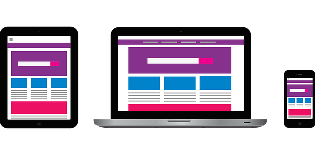
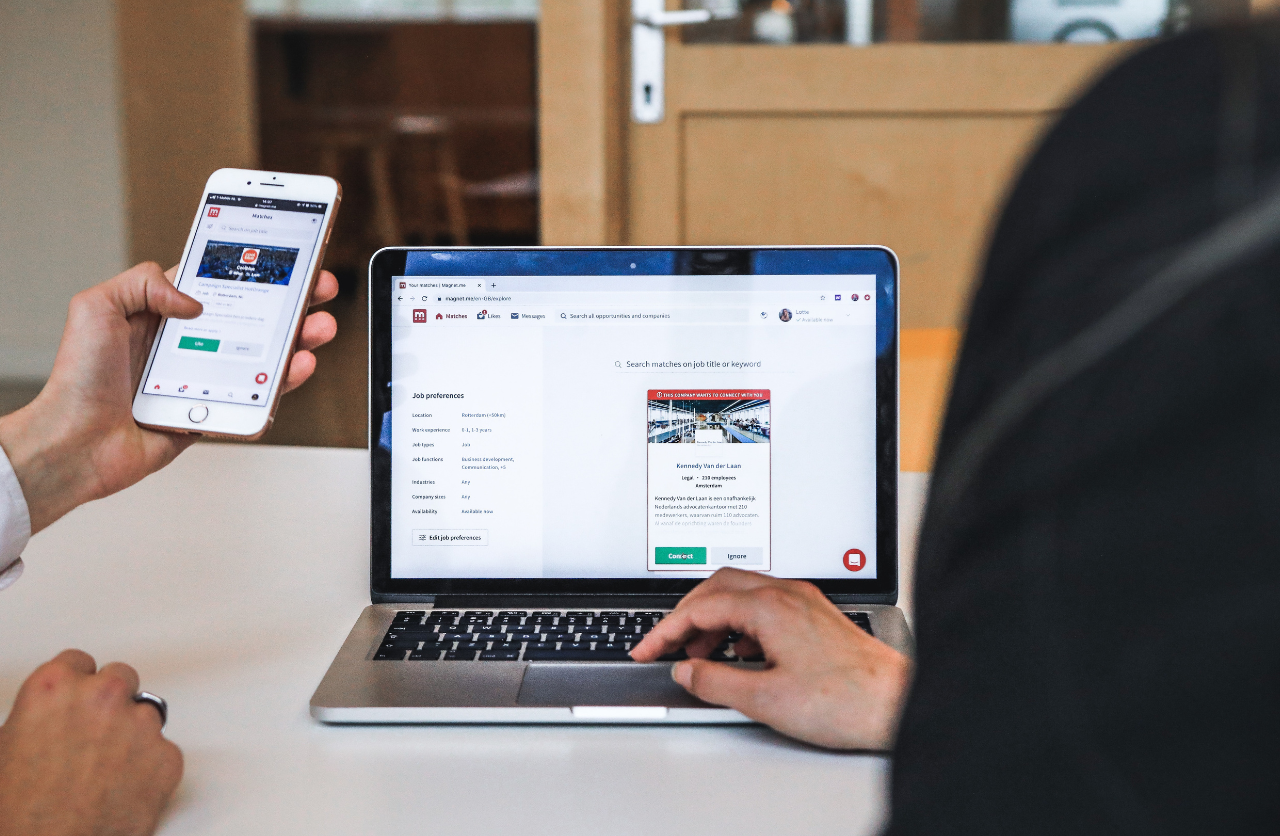
A responsive site looks not only good on the browser but also looks amazing on mobile devices. You can check the Website on both browser and mobile phone to check how it looks. If the title is not proper, images are not fit the content, it means the Website is not mobile-friendly.
Why are Plugins Important?
Plugins are the building blocks of any WordPress website. Using them can bring new functions to your site like adding contact forms, improving SEO, increasing site speed, etc. In simple words, plugins help to make your Website more responsive and user-friendly. Here are tips to make a WordPress website mobile-friendly:
Tip 1: Use a Responsive WordPress Theme
Most WordPress themes are responsive. It means when you increase or decrease the size of the browser, and the Website changes the design accordingly. So, according to the device and browser, the header shrinks, the menu turns into a dropdown style, and images shrink rather than cutting off on the side of the device.
If the theme is not according to your device, then you can set it with the following steps:
- Go to the dashboard>appearance>customize
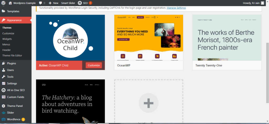
- You can see some controls on the bottom left, there is the desktop version, the tablet version, and the mobile version.
- Select the version you want to make it mobile-friendly.
- For most of the content, it actually looks pretty good.
But what if you are not using a mobile-friendly theme? Thankfully, there are various free and paid plugins to make your Website automatically responsive or mobile-friendly.
Tip 2: Add Responsive Plugins
Make sure that every plugin you install on WordPress also operates on responsive design. There is one within the jetpack that you can use.
- Go to plugins that are already installed.
- Then go to the jetpack menu and click on settings
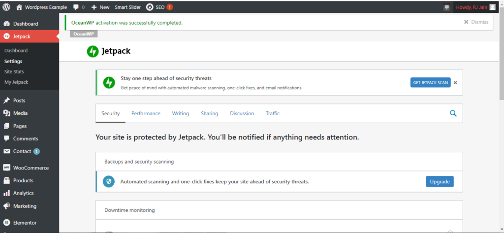
- Then go down to appearance, you see tabs at the top with different tools and plugins that come with a jetpack.
- If you scroll down, you will see a mobile theme.
- Turn on the mobile theme to make your Website more responsive.
- By doing so, it will optimize for smartphones and tablets.
Do a Manual Test
Now, once you are done with the updates for a mobile-friendly and responsive WordPress website, do a manual test of how it looks. Open your website on a mobile phone or tablet. Make sure every photo looks pretty good. The text should also look good on a mobile screen. In case, you find any issue with it make sure you correct it by going to edit in WordPress.
If you want a professional-looking website design for mobile users, Symphony Software can help. We can develop the best website design for your business according to your requirements. Our skilled and experienced web developers can create any website with custom designs.