
A call to action is a crucial aspect of a landing page that’s placed in multiple positions. Sometimes, it’s just the right side of the header, and sometimes you could find it at the bottom too. Note that it’s always placed in areas that instantly catch the attention of the visitor.
Clear from its name, the call to action makes your users take action for conversion. But, like any other content for the landing page design, the call to action should be top-notch so that users would click the button. Here are some of the tips for creating CTAs:
Importance of Call to Action (CTA) For Higher Conversion
#1 CTA Design and Content

A CTA cannot be a good CTA unless it’s designed and written nicely. Whenever you are creating your CTAs, do not get overwhelmed with the words. The idea is to use minimal words and be clear.
For example, if you want some user to buy your product, simply write “Buy Now” or “Hurry, Buy Now .”There’s no point in writing 7-8 words as it doesn’t convert. The maximum number of words should be 4; that’s it! Also, avoid using terms like subnet.
#2 Personalise Your CTAs
Using personalized languages is one of the most efficient ways of creating CTAs. That’s because personalized CTAs help to connect with the users. Terms like my/me are more convertible and personal than you/your. It seems as if the product belongs to them!
#3 CTAs Content that Implies Urgency
Make sure to create a CTA that encourages users to take action immediately. It should be written so actionably that the users would feel like they are missing something if they don’t click. You can use terms like “Hurry,” “Grab,” “Add to Cart/Wishlist,” etc., for best results.
#4 CTA Colors
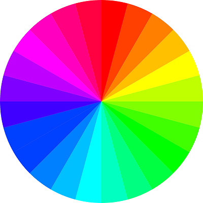
Just like fonts, there are certain colors for CTA that work wonders. The idea here is to choose the shade that catches your attention. For that, you should go for something bright like red or oranges.
Likewise, if you want subtle shades, use blue or green colors. Each color gives different messages. For example, the color blue implies reliability. So, if you want your CTA to show safety, blue colors would be a great pick.
So, do your research on color psychology and see what shade implies what. Then, synchronize it with your CTA to come up with the best CTA color.
#5 Contrasting Colors
Lastly, make sure that your CTA color matches other elements like headers, subheaders, and page layout. That’s because if the landing page is of some other shade, it will look weird! If not the exact shade, you can go for contrasting colors for the perfect combination. For example, if your website has red throughout the layout, a green button for CTAs will be a good pick!
CTA it Right!
Hopefully, the importance of call to action is clear now. Make sure to follow the above tips, and you will have the best CTA for your landing page. Likewise, ensure that your entire landing page is designed precisely too.
At Symphony Software, our proficient designers can create the ideal and convertible landing pages for your business. We have successfully helped various users through our expertise and look forward to help you as well; if you want to employ our services, contact us today.